Dev Diary #27 - Good Friyay!
Happy Good Friday folks!
This week we reworked the opening interaction during the Prologue :)

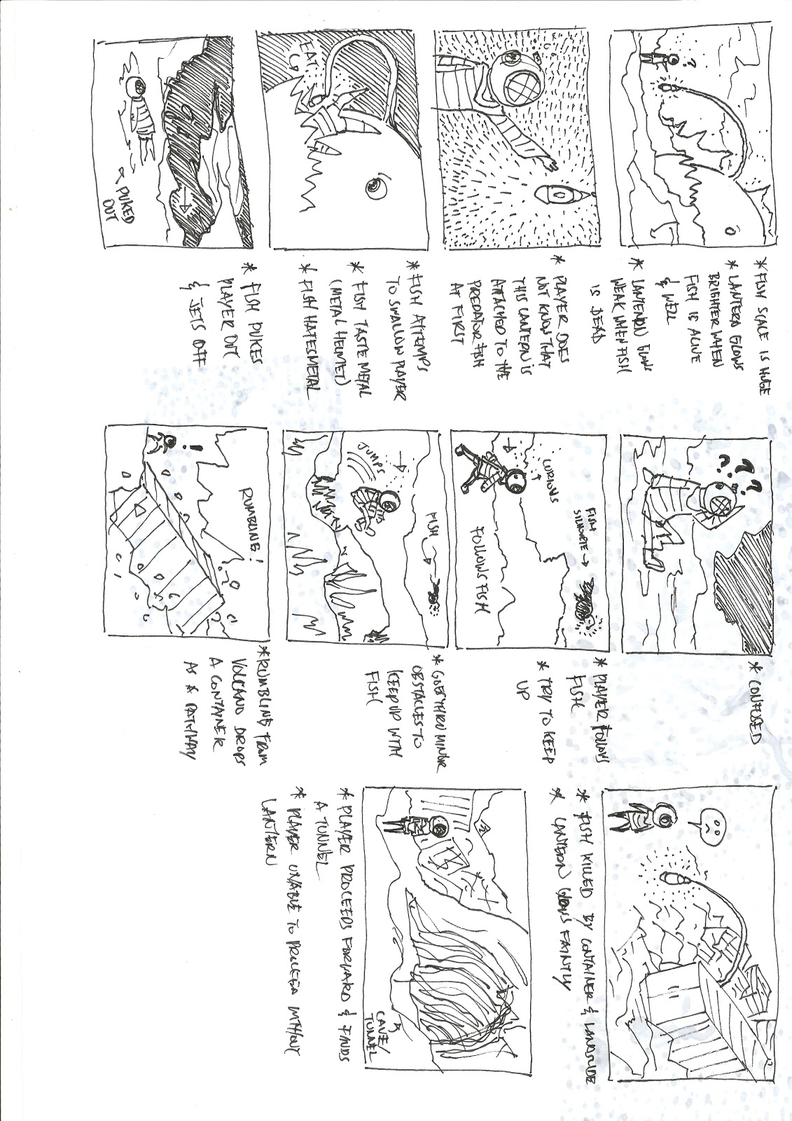
This scene had always been designed with this final sequence in mind, and we finally had the chance to come back and revamp this sequence alongside redesigning the fish as originally intended - this allows the scene to set the mysterious & quirky tone of the game from the get-go.
Here's an early rough-sketch of the scene from 2019. (please pardon the shitty hand-writing XD)

Let me know your thoughts on this latest revamp!
---
Thank you for taking the time to read this dev diary, we appreciate all the support!
We are a small Indie-company that makes game due to our love and passion for storytelling, art, puzzles, adventure & culture, so if you like what you see, do consider supporting us by Wishlisting SAMUDRA on STEAM
or
Feel free to support us also at:
---
Have a great Easter weekend all!
- El
Files
Get SAMUDRA | A Deep Sea Journey
SAMUDRA | A Deep Sea Journey
Hand-illustrated adventure across a polluted deep-sea.
| Status | Released |
| Publisher | |
| Author | Khayalan arts |
| Genre | Adventure, Platformer, Puzzle |
| Tags | 2D, Atmospheric, indonesia, pollution, samudra, Surreal, underwater |
| Accessibility | Textless |
More posts
- SAMUDRA OST | Nocturne Of A Drowned World37 days ago
- I NEED SPACE - DEMO PATCH v0.1.2⭐Apr 13, 2023
- Introducing our next project - I NEED SPACE⭐️Mar 10, 2023
- SAMUDRA Summer Sale! ☀️Jun 23, 2022
- #PlayForOcean Fundraising 🌊Jun 15, 2022
- Support & Vote for SAMUDRA🌱Feb 18, 2022
- What lies ahead✨Dec 31, 2021
- SAMUDRA is now live on Steam!🌊Sep 29, 2021
- Gradient Convergence 2021Sep 23, 2021
- Devlog #35 - #PlasticFreeJulyJul 04, 2021
Comments
Log in with itch.io to leave a comment.
I like the revamp.
The huge fish has a better design - they look more like a real fish, more detailed, and less goofy and less robotic-looking.
Also, the fish's actions look faster, stronger, and more forceful, which makes them seem more threatening. Hopefully that should help add more tension to the prologue!
Having the player character get eaten and then spat out is, of course, a good touch - it adds more excitement, and, like the post said, it should help set the tone of a place which is dangerous but also kinda quirky.
Everything else is just generally more detailed and nicer to look at - the backgrounds, the effects, the character's little thought-bubble, and so on.
It's also good that the player character stands still as the title appears. First, that makes it look like the character is so shocked by what they've just been through that, for a minute, they can only stand there. That helps to express the feel of this sequence. Secondly, since the character is standing still, they're less likely to distract the player's attention from the title appearing on the screen.
(Of course, the character could just have been standing still because the player wasn't moving them at the time... well, either way, it works!)
Thank you for this great feedback & for acknowledging the subtle details within the scene :D We did redesign the icon-bubble too and this actually ties into the overall interaction mechanic that we had improved on for the rest of the game as well.
In fact, we are actually going to fit in another animation here at the very end during the title appearance; you hit the nail right on the head when you mentioned that the kid should be shocked by what just happened, and we'll emphasize that better ;D
Have an awesome weekend ahead!
I hope the final version of the demo will release soon!
Sooon! Fingers crossed
I just can't believe how incredible this is! I thought it's just a concept art on IG! I'm happy it made it into the game!
Super glad you like it! We were unsure on updating this for a long time - mostly due to time constraint, but seeing it unresolved just didn't sit well with us, so happy now that we're finally able to get back to improving this scene!